What South Africa would look like if mapped by population size

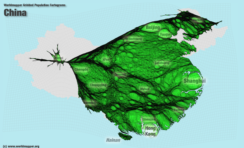
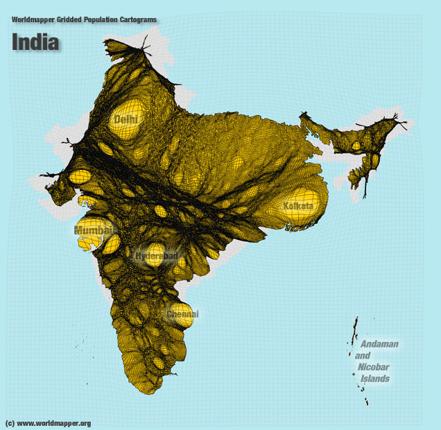
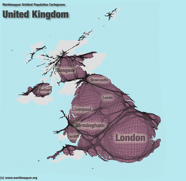
A group called Worldmapper.org has created gridded population cartograms of countries across the world, showing how countries would be represented if they were depicted by population size.
Each cartogram shows a country or territory with an accentuation of its internal population variation – more populated areas appear more inflated while sparsely populated areas shrink.
It’s unsurprising to find that many countries are distorted, ballooning around big cities, where half the world’s population lives.
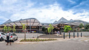
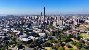
In South Africa, the greater Johannesburg area – including Sandton, Soweto, Ekurhuleni and the West Rand – accounts for well over 10 million people.
Gauteng is the coutnry’s smallest province, but is home to 13.2 million people. The Northern Cape, which is the largest province in the country, has the smallest population of just under 1.2 million people.
This is how South Africa looks when adjusted to represent population.

South Africa population map
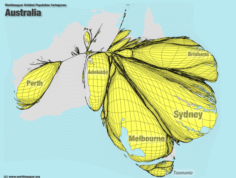
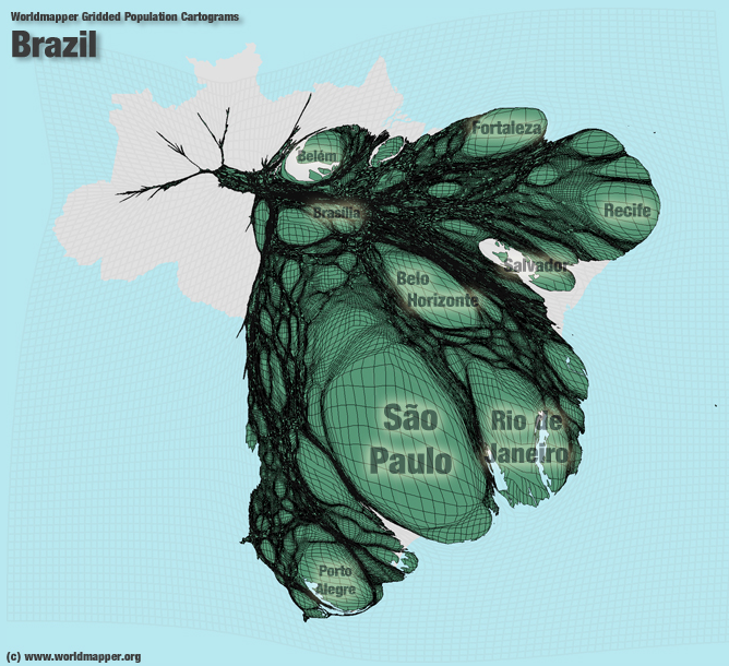
The following maps show the same representation of population around some of the biggest cities in the world:
Australia
Brazil
China
India
Nigeria

Russia

UK
United States

(H/t to RollingAlpha)
More on South Africa.
Gauteng population breaches 13 million