New lick of paint for Cell C

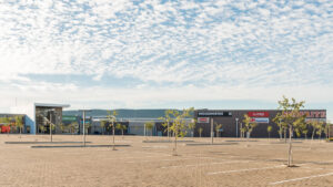
Cell C is currently revamping its flagship stores “to make them more customer-centric”, which includes a more prominent presense of the colour blue in the company’s store revamps and advertising.
“We are not rebranding but merely revamping our flagship stores to make them more customer-centric. We are changing the layout to ensure we are able to better serve our customers,” explained Cell C spokesperson, Karin Fourie.
“Part of the revamp includes making the blue in our colour bar more prominent to give our stores (and ads) a fresh new look,” said Fourie.
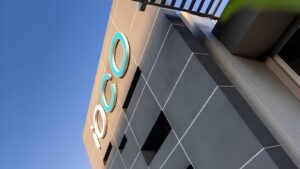
The strong presense of blue is visible throughout Cell C’s branding, with a lot of green also starting to appear in the company’s advertising.
There is strong speculation that Telkom and Cell C are currently discussing a potential merger between the two companies, but it is understood that the more prominent blue branding from Cell C has nothing to do with a potential deal with Telkom.

Cell C advertising with blue and green colours
Related articles
Investors knocking on Cell C’s door