One graph that shows where in South Africa rental prices have increased the most

Property finance group PayProp has released its latest rental index for the third quarter of 2017, showing how much rental prices have increased and decreased across South Africa.
According to PayProp head of data and analytics, Johette Smuts, indications in the rental market are that tenants and consumers remain under pressure – if not from rent growth then from inflation in general, which is currently outstripping rent growth.
The rental markets in the different provinces won’t all feel the same amount of pressure, though, Smuts said, with cumulative provincial growth rates giving the necessary long-term context that annual growth rates do not.
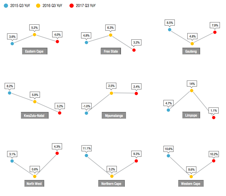
Comparing year-on-year (YoY) growth rates of Q3 and Q2, PayProp’s index data showed that rents are currently growing at a lower pace, considering growth across the provinces.
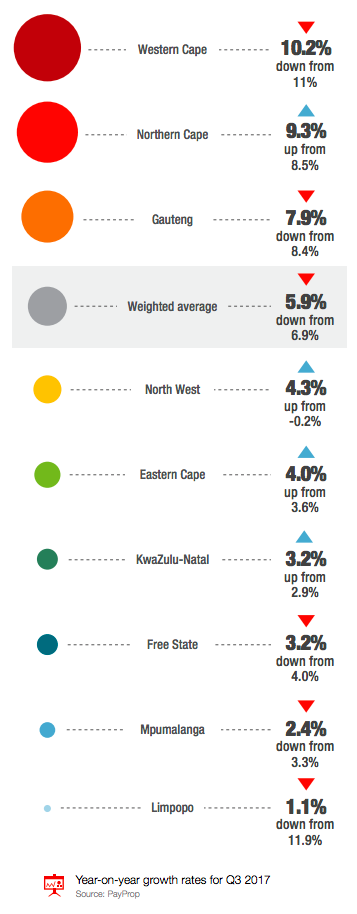
Five out of the nine provinces saw a reduction in the rental growth rate, while the four provinces showed modest increases, contributing less than a third to the total weighting of the overall growth.
As a result, the weighted average YoY growth rate decreased from 6.9% to 5.9% between Q2 and Q3, PayProp said.
“It seems as though every few months a new province steals the show with stellar rental growth rates. Unfortunately, what goes up must come down again, and in Q3 it was Limpopo’s turn to fall from the dizzy heights of Q2, when YoY growth was 11.9%, to a mere 1.1%,” Smuts said.
On the opposite end of the scale, the Northern Cape clocked YoY growth of 9.3% in Q3, up from a below-average 3.8% a mere six months before.
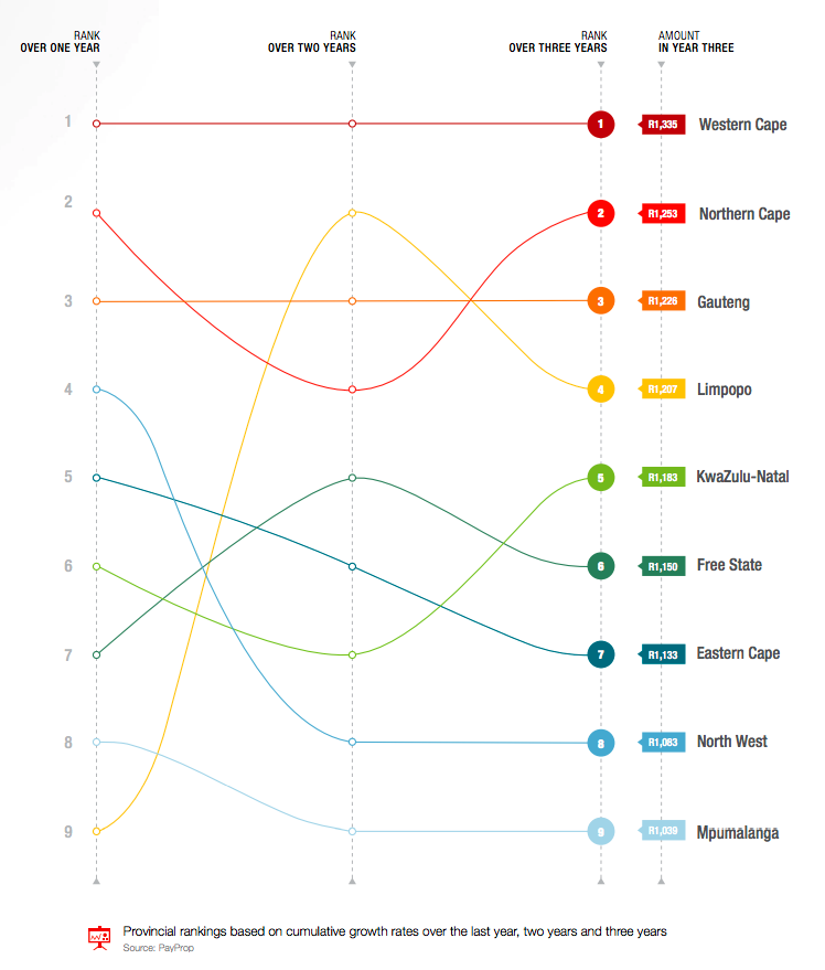
“From a buy-to-let investor’s perspective, it makes sense to put these ups and downs into context with the help of cumulative rental growth figures. Landlords who are in it for the long run seek out sustained growth potential over longer periods, to help them distinguish flash-in-the-pan investments from solid gold returns,” PayProp said.
To illustrate cumulative growth, the group painted a hypothetical example: if rent in all provinces were R1,000 at the same starting point, where would they be now, and which province would show the best rental growth over one year, two years and three years?
The results are outlined in the graph below: